

Curatorial Review
by Anna Gvozdeva
Where Colors Meet
Colour as Event
Sophie Bernard’s Where Colors Meet treats colour not as a property of things but as an event that happens between them. Her six photographs isolate points of contact — red against blue, pink against ochre, orange against glass — and let those borders carry the image. The approach recalls Josef Albers’s insistence that colour is relative and never seen in isolation. It also belongs to a photographic lineage running from Franco Fontana’s flattened landscapes to Luigi Ghirri’s quiet ironies of the everyday. Bernard’s distinction lies in her patience with ordinary sites: a running track, a farm field, a fire stair.
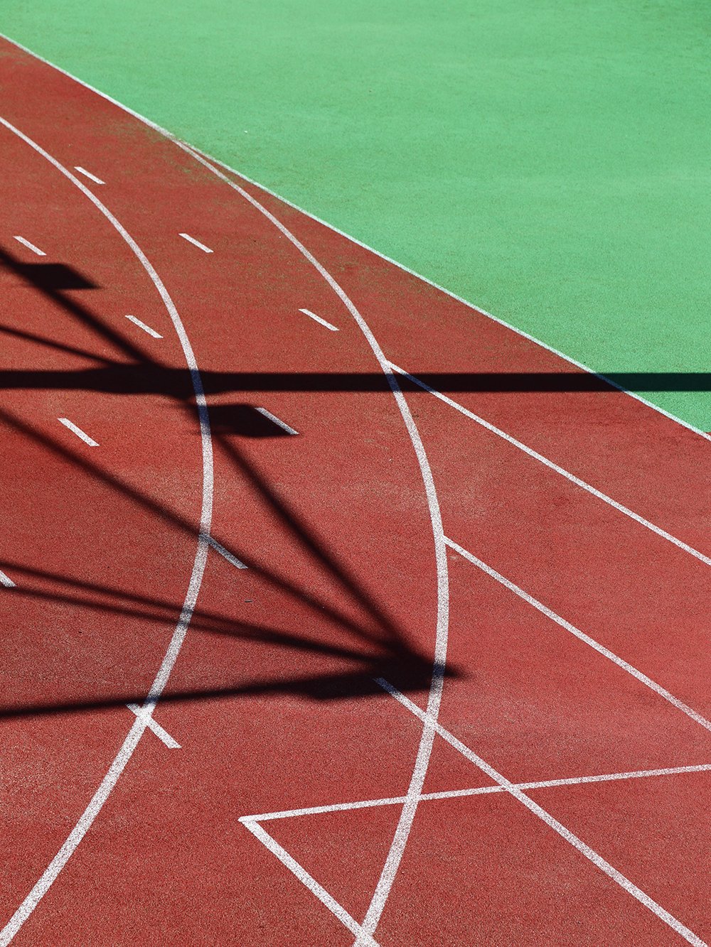 Sophie Bernard | Crossing Lines | 2026
The Works
Crossing Lines is the most rigorous image in the series. Brick-red track and acid-green infield meet along a single diagonal, while white lane markings curve, cross and form a stray triangle. The shadow of an unseen structure then cuts through everything, adding a black third term that turns a sports surface into a drawing.
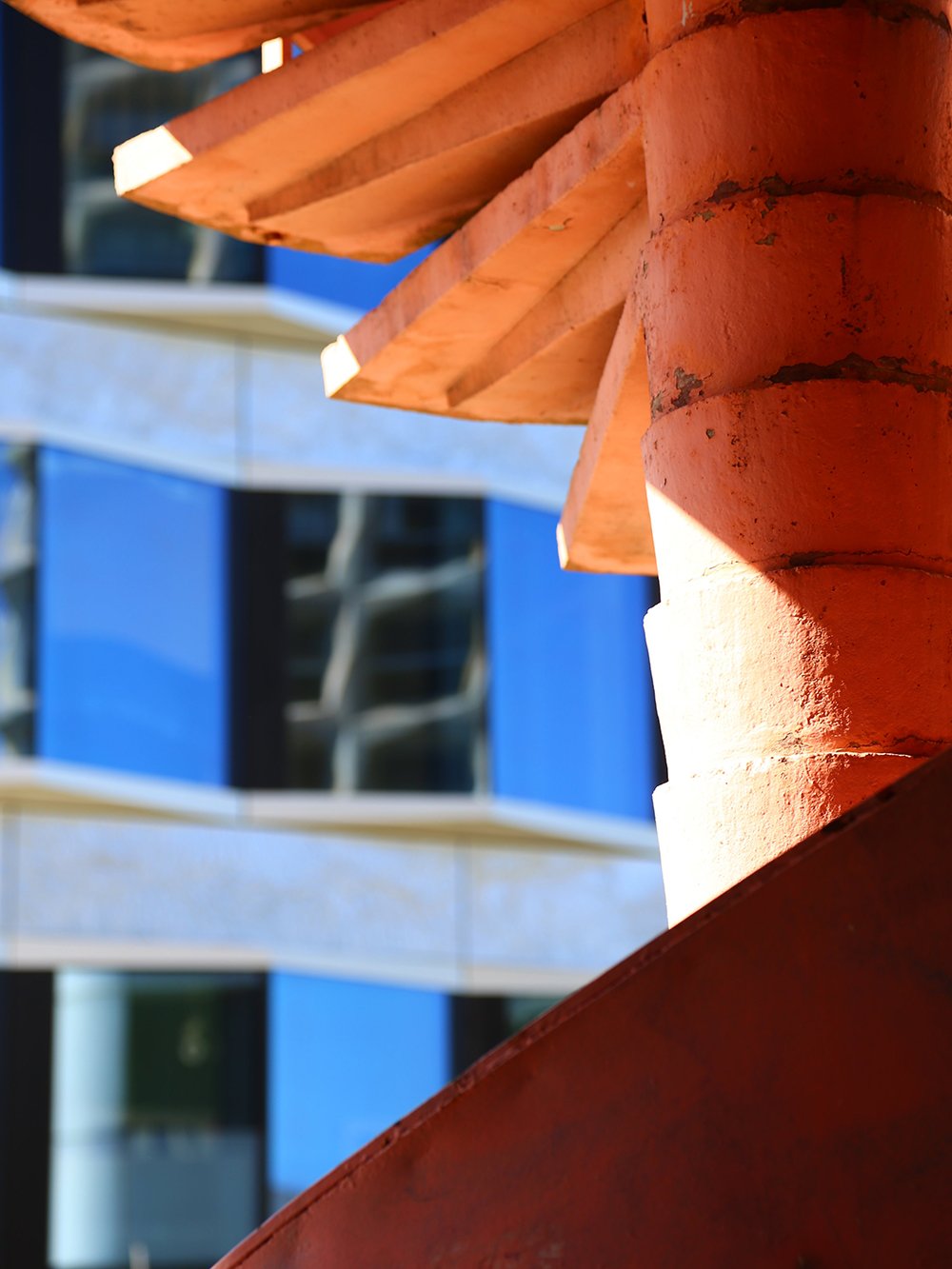 Sophie Bernard | Turning Point | 2026
Turning Point works by touch as much as by hue. The flaking orange paint of a spiral stair fans out against a softly blurred blue façade, and the shallow focus lets the complementary pair vibrate without competing.
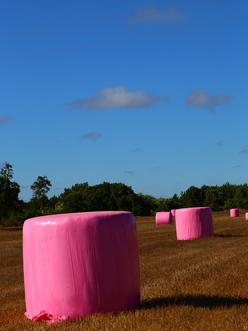 Sophie Bernard | Out of Place | 2026
Out of Place makes the series’ clearest statement about natural and artificial colour. Silage bales wrapped in improbable bubblegum pink recede across a stubble field under a deep blue sky. The diagonal power lines above are a smart echo: another human intrusion into the pastoral.
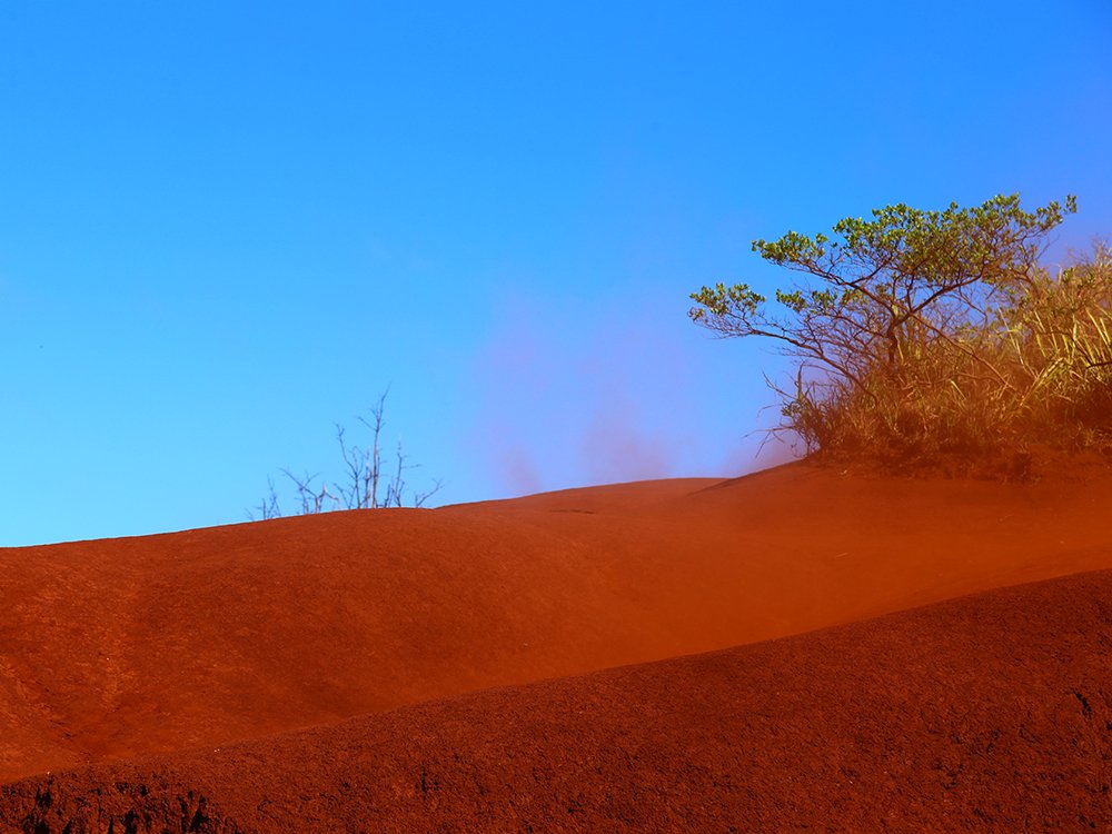 Sophie Bernard | Red Horizon | 2026
Red Horizon is the boldest counterpoint, because here the colours refuse to meet cleanly. Wind lifts red dust into the cyan sky, and the boundary dissolves into haze.
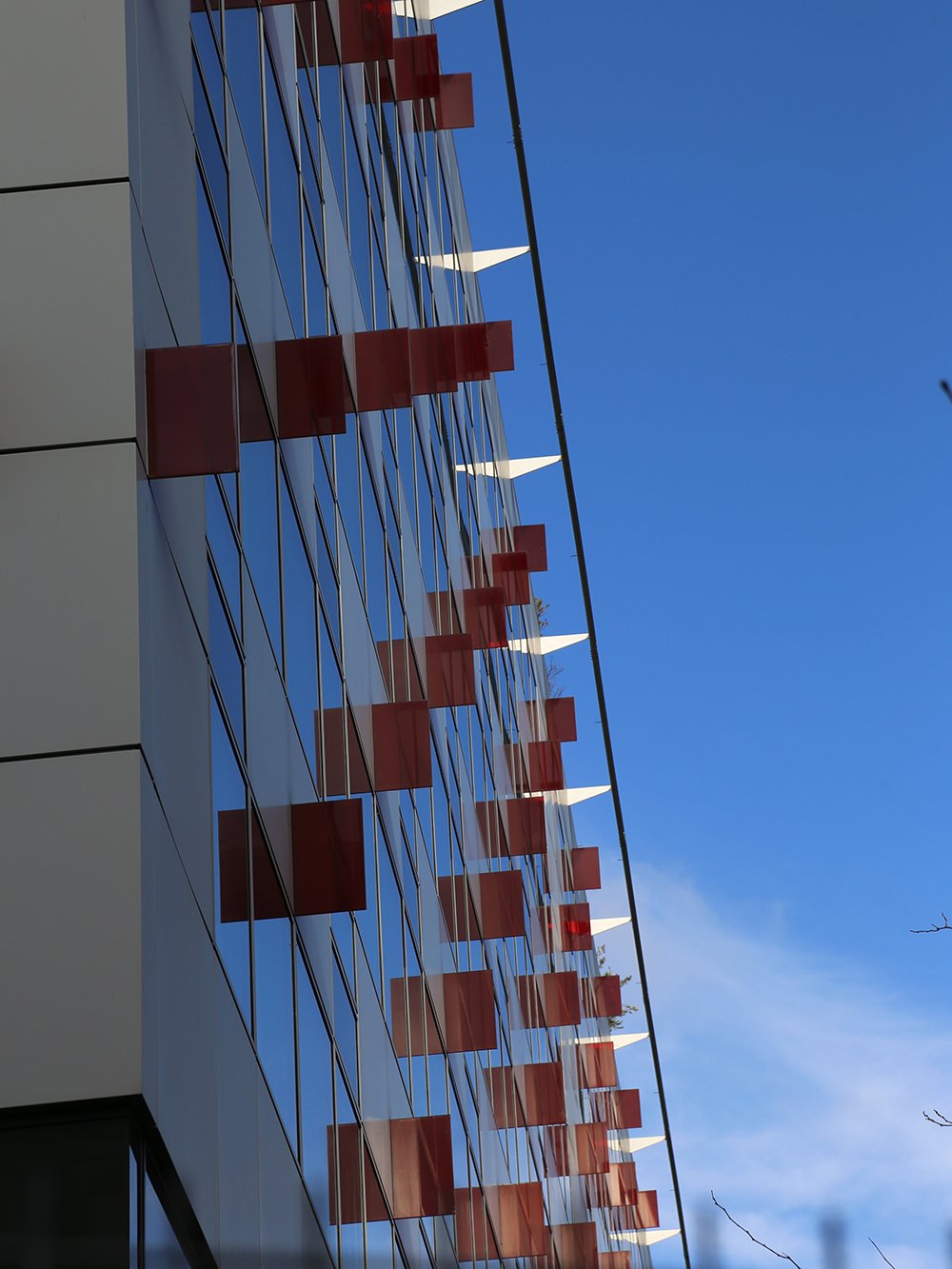 Sophie Bernard | Red Interruptions | 2026
Red Interruptions finds the theme in architecture: wine-red glass panels and white fins punctuate a façade that mirrors the sky, and the upward angle compresses them into a rhythmic score. Pop is the most playful work and the least resolved. The green lettering on a photographed popcorn ground is witty, and the striped awning adds a fairground note. Yet the word itself dominates, and the image reads more as signage than as an encounter of colours.
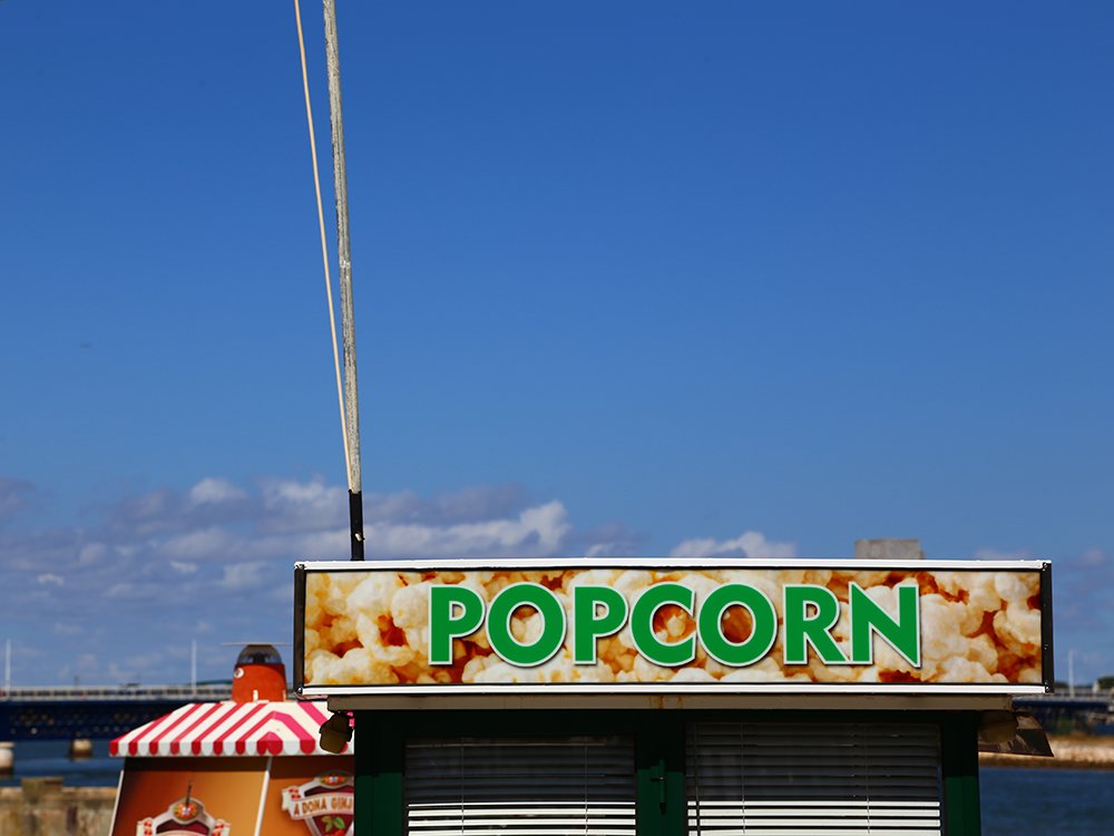 Sophie Bernard | Pop | 2026
Assessment
The series is coherent and confidently made, with a clear eye for structure and a sure sense of where to place an edge. Its main limitation is range. Five of the six images rest on a red–blue or orange–blue opposition, and a clear sky does much of the work. The statement promises “saturated against muted”, yet almost nothing here is muted; every surface plays at full volume. In places, especially the sky of Red Horizon, saturation edges towards a digital finish that flattens the subtlety the project claims to value.
The strongest images, Crossing Lines and Turning Point, find contrast within materials rather than against the sky. That is the direction worth pursuing. Overcast light, quieter palettes and a tighter edit would test whether a colour can still become “a presence of its own” when it does not shout. Bernard clearly has the eye; the next step is to widen the vocabulary.
0 comments on “Sophie Bernard”